
Our Homepage, Before and After: One World, One Ant
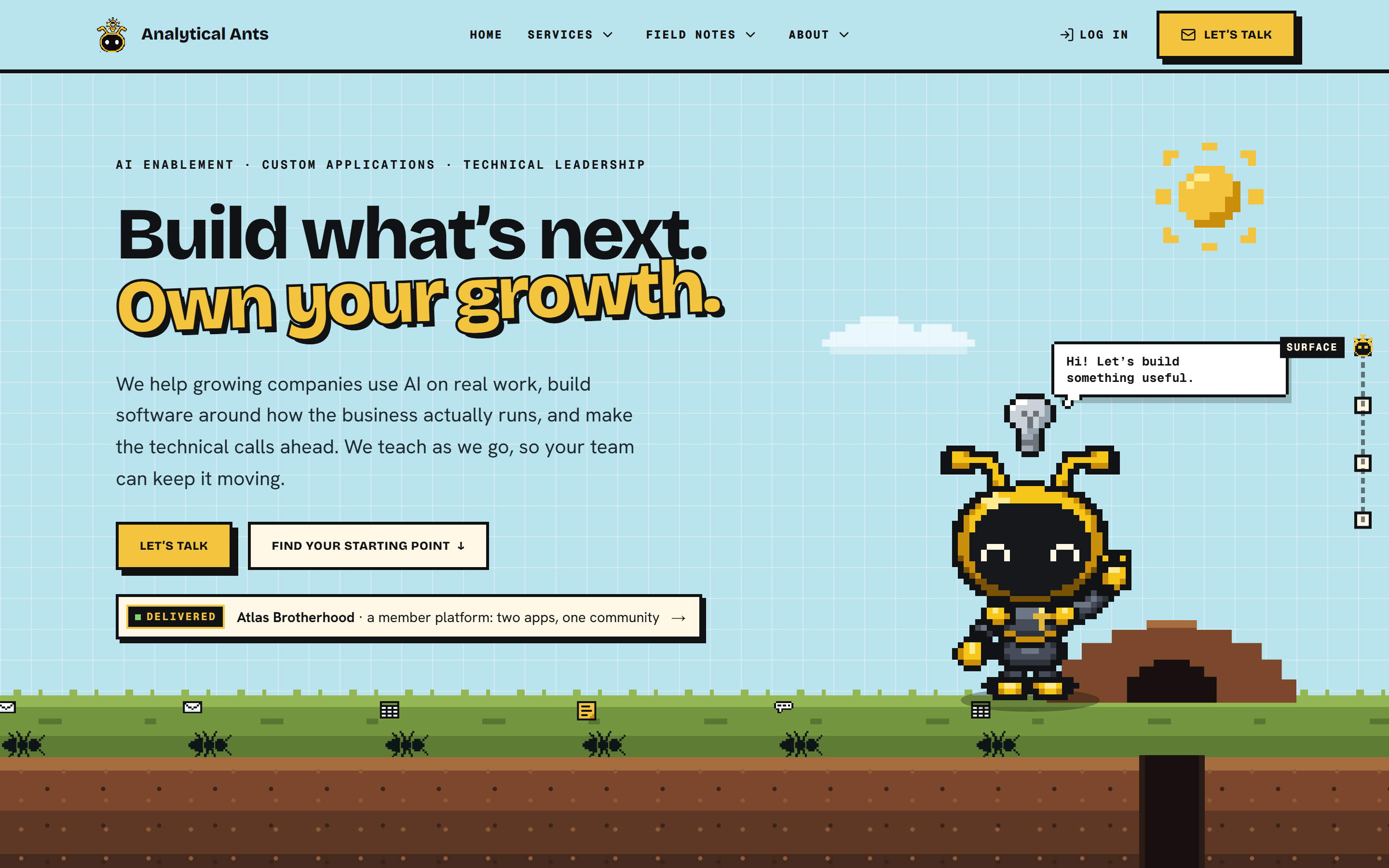
Our old homepage looked like nobody else's. It still took a careful read to learn what we actually do.
TL;DR
- We redesigned the Analytical Ants homepage so it explains itself in five seconds: one plain sentence about what we do, delivered proof above the fold, and a "Sound familiar?" picker that sends each visitor to the right starting point. We kept the pixel world, and the ant from our videos now lives on the page.
- Visitors start from their own situation, in their own words, instead of decoding the names of our three services.
- The same character now appears in our videos and on every page, because the site runs the same drawing code.
- The whole site follows one written set of rules, with automated checks that keep the next page on theme.
Why does a distinctive homepage still lose people?
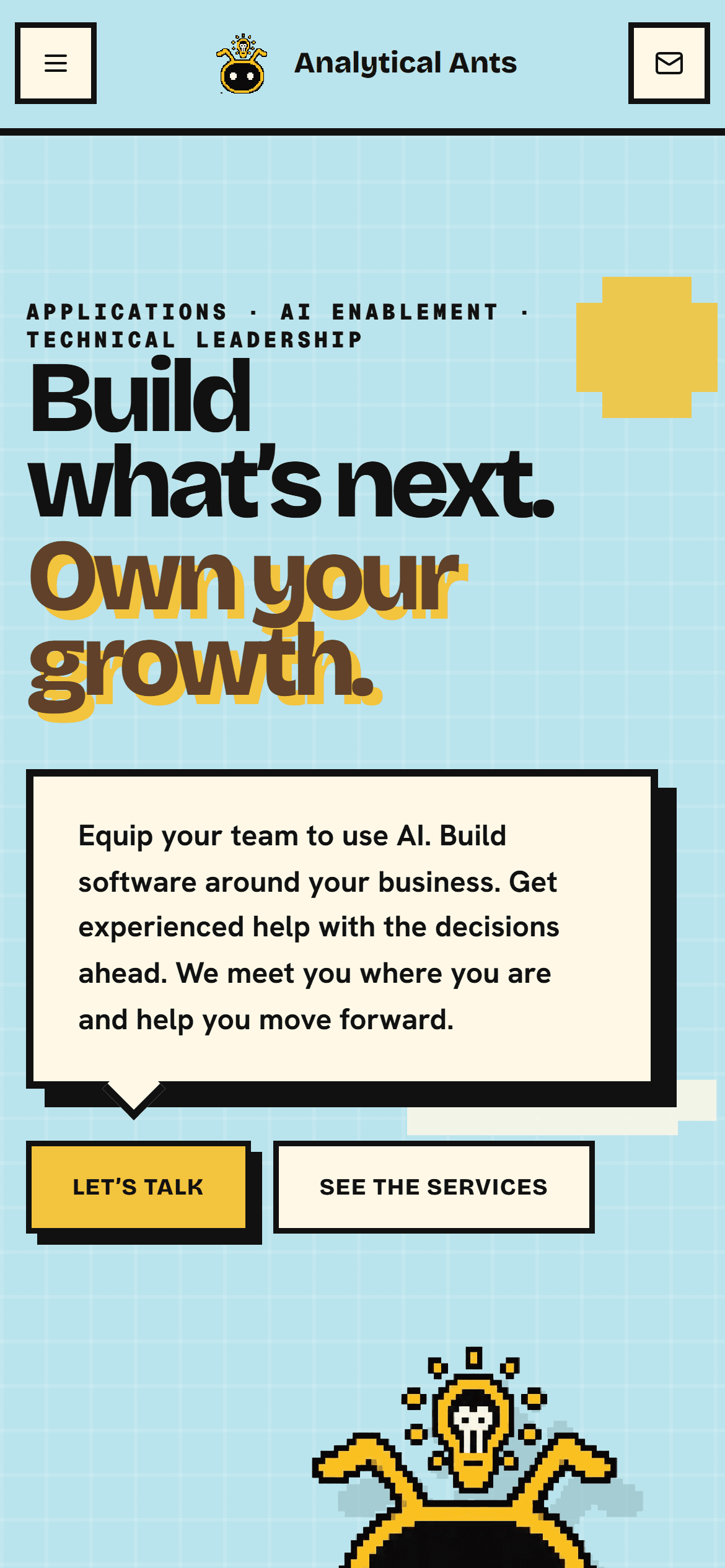
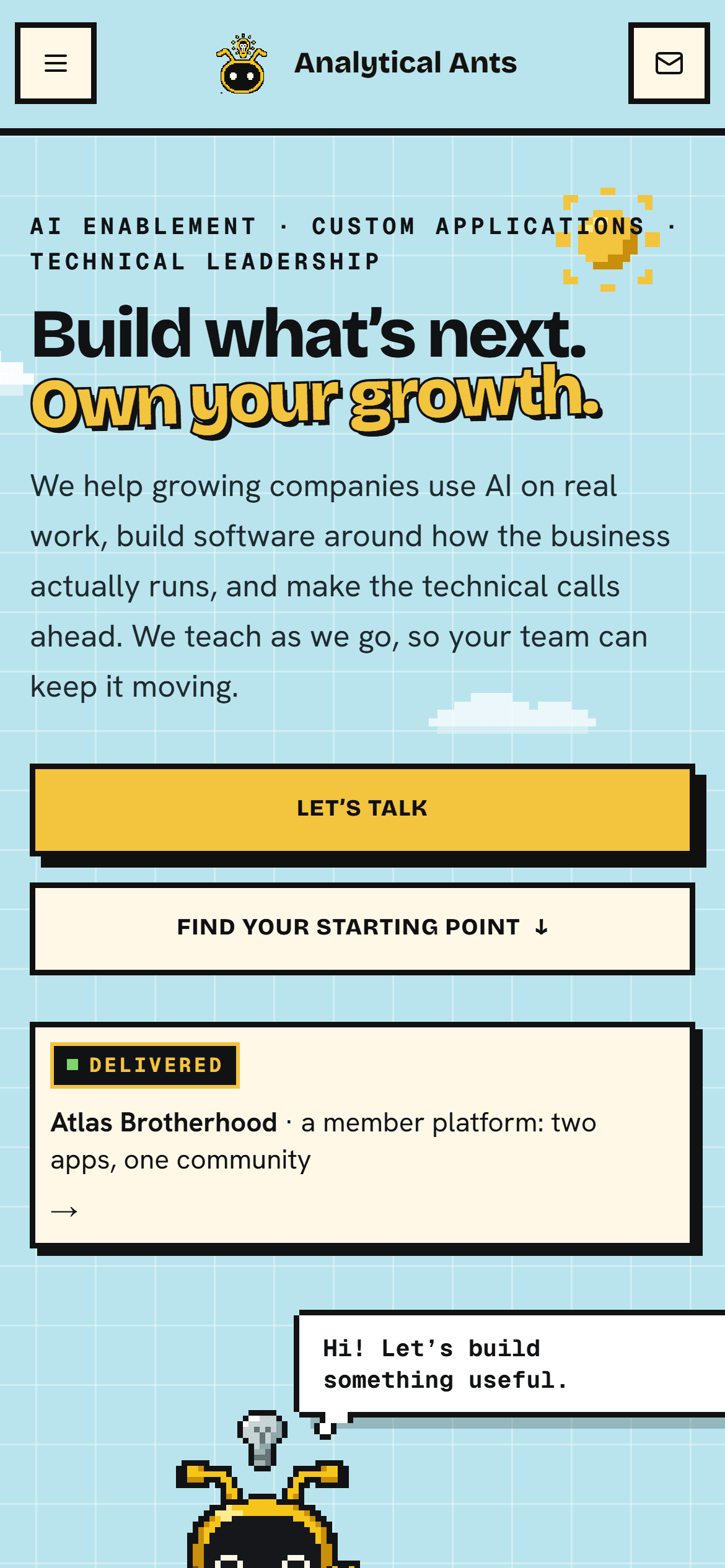
A distinctive look earns attention, but attention is not understanding. Our old hero led with "Build what's next. Own your growth." and put what we actually do (applications, AI enablement, technical leadership) in small type above it. A visitor had to scroll into the underground chambers before learning whether we could help.
That is a real cost. Every second a visitor spends decoding the page is a second they are not deciding to talk to us.
What changed on the new homepage?
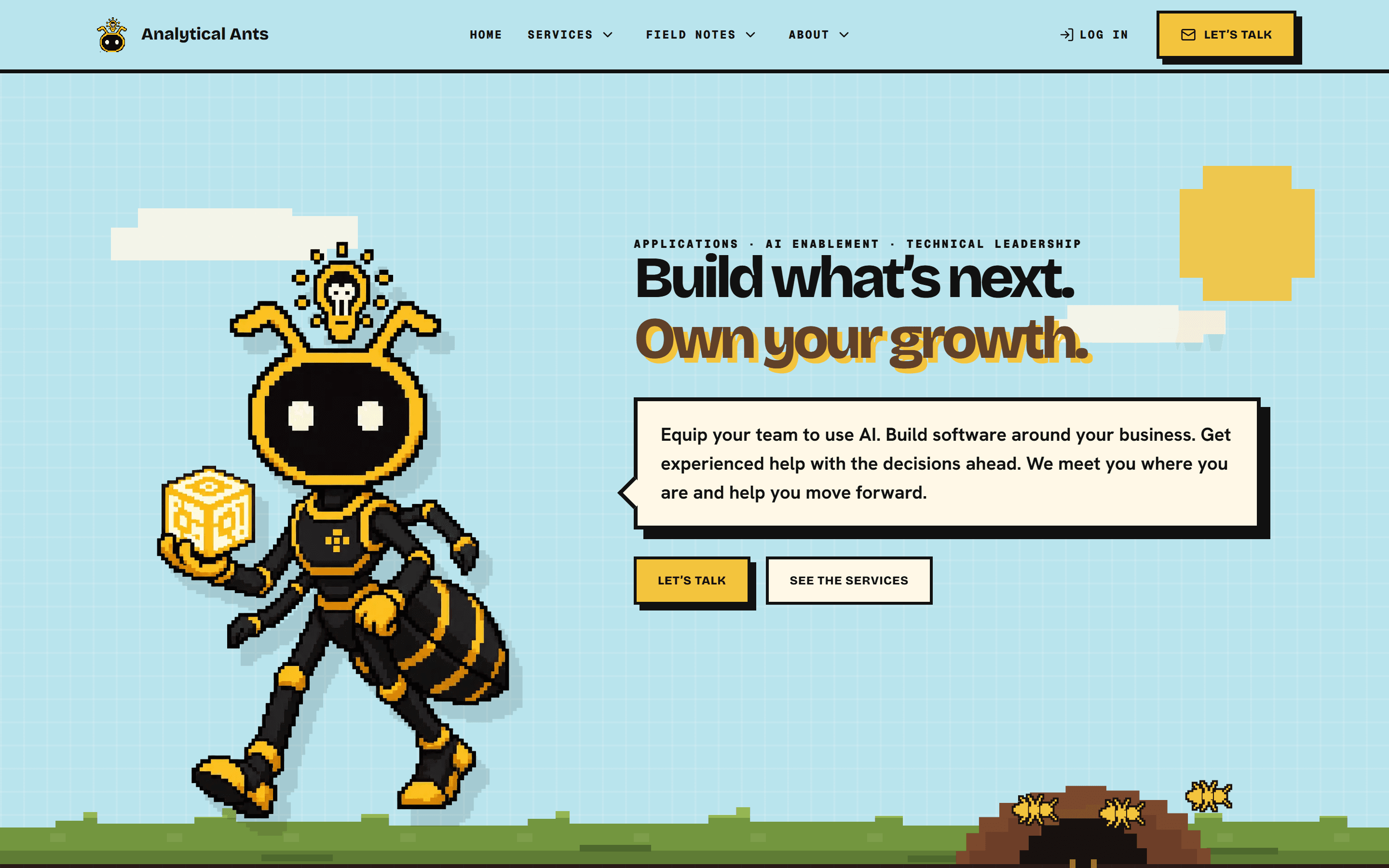
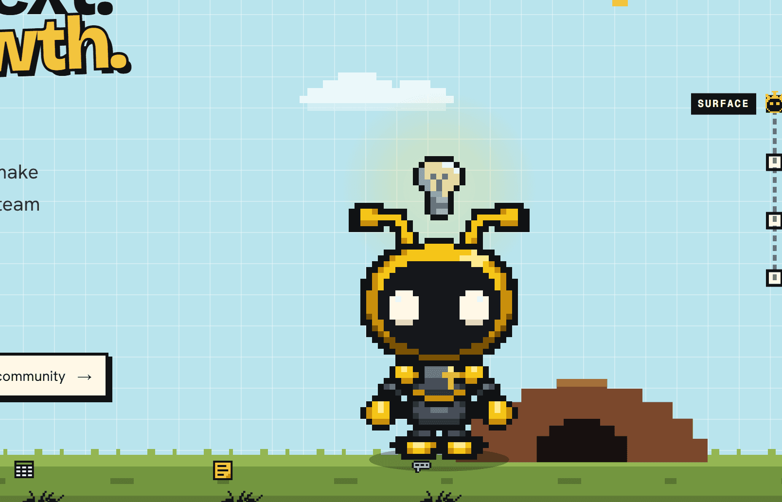
We kept the sky, the soil, the burrow and the ant, and changed what each part does. The headline stayed. Everything around it now works to answer three questions fast: what do you do, is it for me, and where do I start?
1. The first five seconds say what we do
The sentence under the headline now names the work in plain words: use AI on real work, build software around how the business runs, and make the technical calls ahead. A small proof chip sits under the buttons: Atlas Brotherhood, Delivered, linking to the build itself. The ant walks in, waves, and gets out of the way.
2. Visitors start from their problem, not our service names
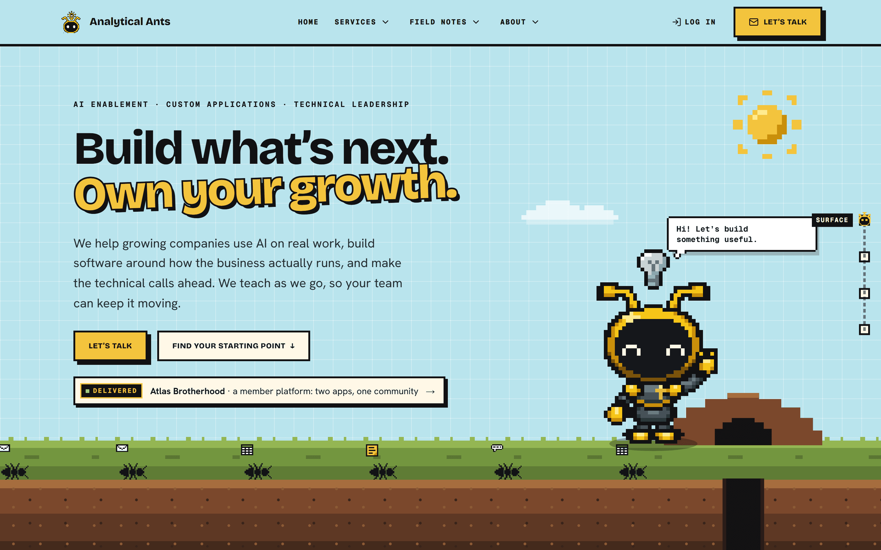
Most people don't arrive thinking "I need Application Development." They arrive thinking "our systems don't talk to each other." So the first section underground is a picker called Sound familiar? with six situations written the way buyers describe them.
Pick one, and the page answers: where to start, why, and a button to talk about it with that service already selected on the contact form. The ant walks through a tunnel to the matching chamber, and its lamp comes on. The three chambers stay the same size, so no service is dressed up as the "right" answer.
3. The ant from our videos lives on the page
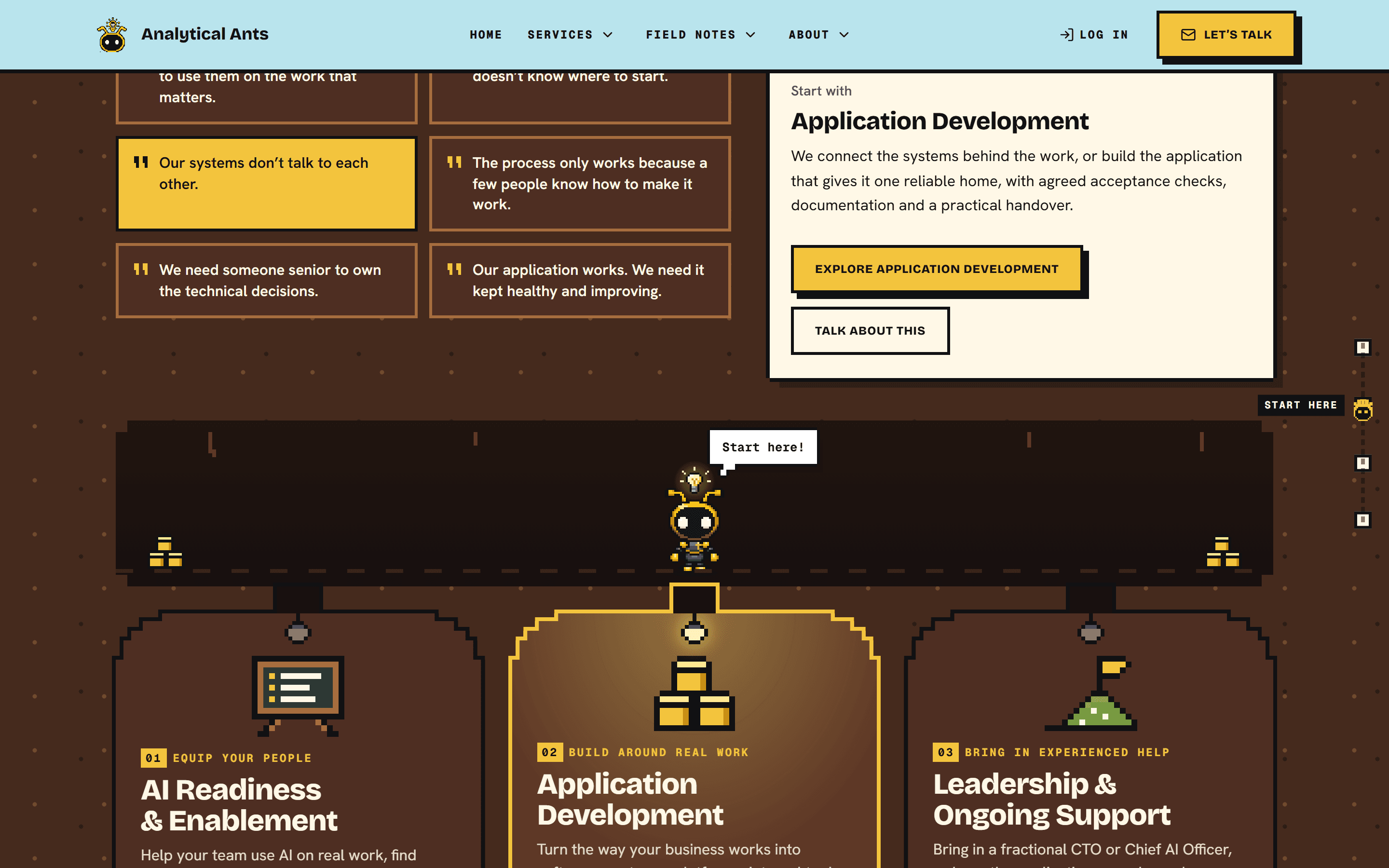
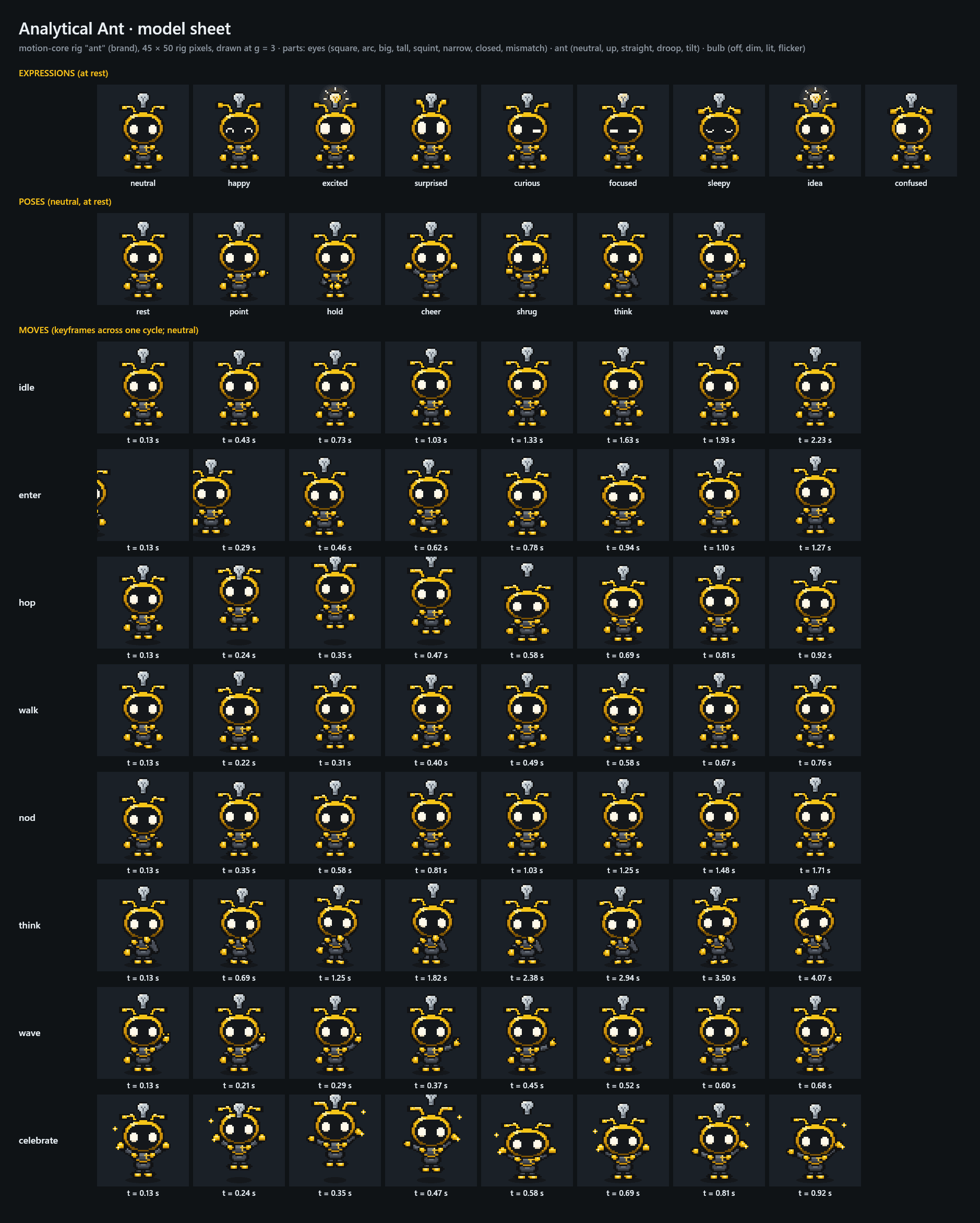
We make our videos with Cutgraph Studio, a video tool our sister company has in development. Its ant is not an illustration. It is a small program that draws him on a 45 × 50 pixel grid, with named expressions, poses and moves. The website now runs that same program, copied in by a sync script. When the ant changes for a video, the site changes with it.
That also made him responsive. Move the mouse near him and he turns to face it, his antennae go up, and his bulb brightens the closer you get. Hover the main button and the bulb lights: the idea, right where the decision is. Click him and he celebrates.
4. Proof sits in the light
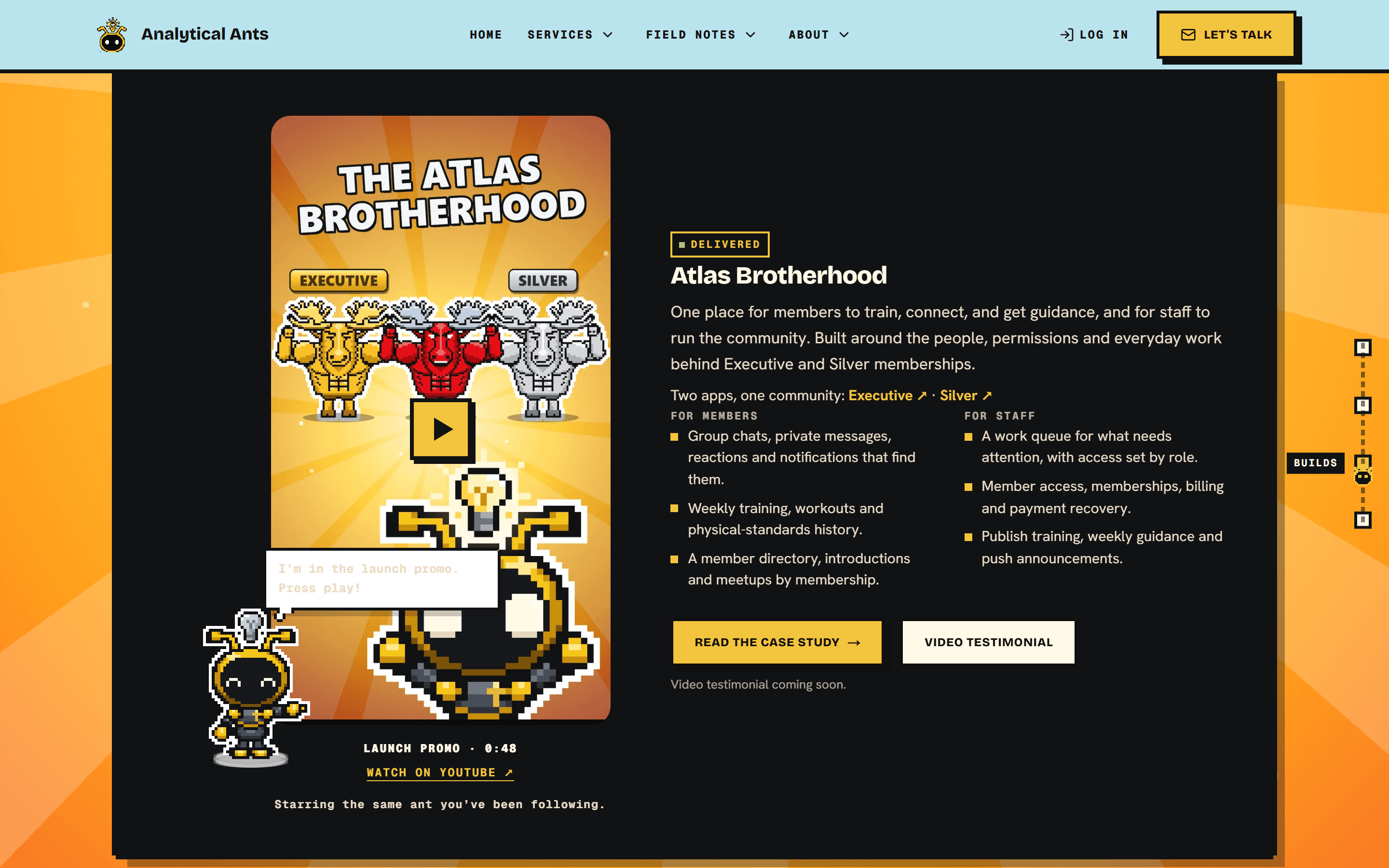
Featured builds now sit in the warm, rayed backdrop our videos use when the ant's bulb lights up. Atlas Brotherhood comes first, with its launch promo. The ant points at it, because he is in it. Our sister company's product portfolio is the second tab.
5. Every page follows the same rules
Every page now opens on the surface and ends back on it. Services, each service page, About, Contact and the Field Notes archive all share the same pieces: a hero with the live ant, underground sections for the working detail, and a return to the sky with one clear next step. Even the missing-page screen has a confused ant.
Why did we skip the 360° sprite-sheet trick?
A popular way to build an interactive mascot is to generate an expression sheet, render a 360° video of the character, cut the frames into a sprite and map them to the pointer. That raises fidelity when a character only exists as art. Ours already existed as code, so a generated sprite would have been a second ant that drifted from the one in our videos.
The broader mistake is treating "interactive" as "more frames." Motion earns its place when it tells the visitor something. The bulb lighting over the main button says this is the idea. The lamp coming on says this is where to start. And for anyone who turns motion down in their device settings, the ant simply stands still in his pose.
How can you apply this to your own site?
You don't need a mascot to use what made the difference. Start with the words, then let the design carry them.
- Run a five-second test. Read only your headline, the sentence under it and your buttons. Do they say what you do, for whom, and what to do next?
- Put one piece of real proof above the fold, with its status stated honestly.
- Let visitors pick their situation in their own words, and map each one to a starting point.
- Keep one source for your brand character. If it appears in video and on the web, both should draw from the same asset or code.
- Make motion mean something, and respect reduced-motion settings.
- Write the rules where your tools can read them. A design contract, shared components and an automated check keep the next page on theme, whether a person or an AI agent builds it.
How was the redesign built?
The redesign was built with Claude Code, an AI coding agent, working inside our website's repository. Our site runs on Prompt Your Site, which keeps the brand voice, the customer profile, the design rules and the audits in the repository, where an agent reads them before it writes anything. That is why the new copy follows our voice and our claim rules: they were in the room.
We then turned the new look into rules. One document describes the world and when to use each piece. A static check fails if anyone adds a second mascot or edits the synced ant by hand. An acceptance test opens every public page at phone and desktop widths and confirms it starts and ends on the surface, has one headline, no sideways scrolling, and a live ant. Every change goes through a pull request we review before anything goes live.
Frequently Asked Questions
What is the "Sound familiar?" picker on the homepage?
It is a short list of six situations written the way business leaders describe them, such as "our systems don't talk to each other." Choosing one shows which of our three services to start with and why, and links to the contact form with that service already selected. No sign-up or scoring is involved.
Is the ant on the website the same one in your videos?
Yes. The ant is drawn by the same code our video tool uses, copied into the website by a sync script rather than redrawn. His expressions, poses and moves match the videos, and a change made for a video reaches the website the next time we sync. The Atlas Brotherhood launch promo stars the same ant.
Does the animated ant slow the page down or get in the way?
He is small by design: a tiny canvas redrawn only while he is on screen, and paused in background tabs. Everything he says is decoration; every piece of information is in the text. If your device asks for reduced motion, he stands still in his pose and the scenery stops moving.
How do you keep an AI agent on brand when it edits a website?
Give it the rules where it works. We keep the brand voice, customer profile, design contract and shared components in the repository, and add automated checks that fail when a page drifts. The agent reads the rules before writing, and a person reviews every change in a pull request before it goes live.
Can you redesign our website this way?
Our services center on applications, AI enablement and technical leadership, so a redesign fits best when it is part of a larger piece of work. For a website you want to run yourself, Prompt Your Site is the product our own site runs on, built to be run with Claude Code by the people who own the site.
If your website or your team's tools need to explain themselves faster, tell us about the work you want to move forward.
About the author: William Rodriguez is the founder of Analytical Ants. He builds applications around real work, helps teams use AI on it, and provides technical leadership, and he directed this redesign. More about Analytical Ants.